Yet another COVID model.
I did this modelling because I was asked to provide some COVID estimates for a hospital. There have been lots of models in the last few weeks and I don’t want to reduce the signal-to-noise ratio in this vitally important area, but I’m sharing this in case someone finds my approach useful. All the code is here. I have used similar models before to simulate disease numbers over time, for example my PhD student Dimity used microsimulation to examine the long-term effects of climate change (Stephen and Barnett 2017).
There is a huge caveat to this modelling which is a dramatic simplification of reality, and none of the estimates should be taken as fact. Neither should any of the confidence intervals be taken as a solid estimate of the best or worst case.
We create models like these to help us understand what might soon happen and how interventions might help. Doing this modelling has also had the added benefit of giving me a better understanding of the modelling issues.
All my models are based on the excellent ordinary differential equation models by Alison Hill. My models are a microsimulation version of those models, and I have validated my code by comparing my results to Alison’s. I also make heavy use of the MicSim package for running microsimulations in R written by Sabine Zinn.
Flowing water or ice
I think of ordinary differential equations like a series of inter-connected bath tubs, with the equations controlling the force of the tap and the size of the plug-holes. The level of the water in each bathtub over time is what we are interested in. In this model we start by pouring all the water into the “Susceptible” bath at the top of the chain.
A microsimulation is similar, but we can think of it using ice-cubes instead of water, with each individual being an ice-cube. The more ice-cubes we have, the more the microsimulation will behave like water. But when numbers are low, there’s a greater chance of small number of stochastic events (bumping ice-cubes) influencing the trajectory of the flow. Microsimulations are also called agent-based models.
The diagram below shows the states (bath tubs) for the COVID-19 model and how they connect.
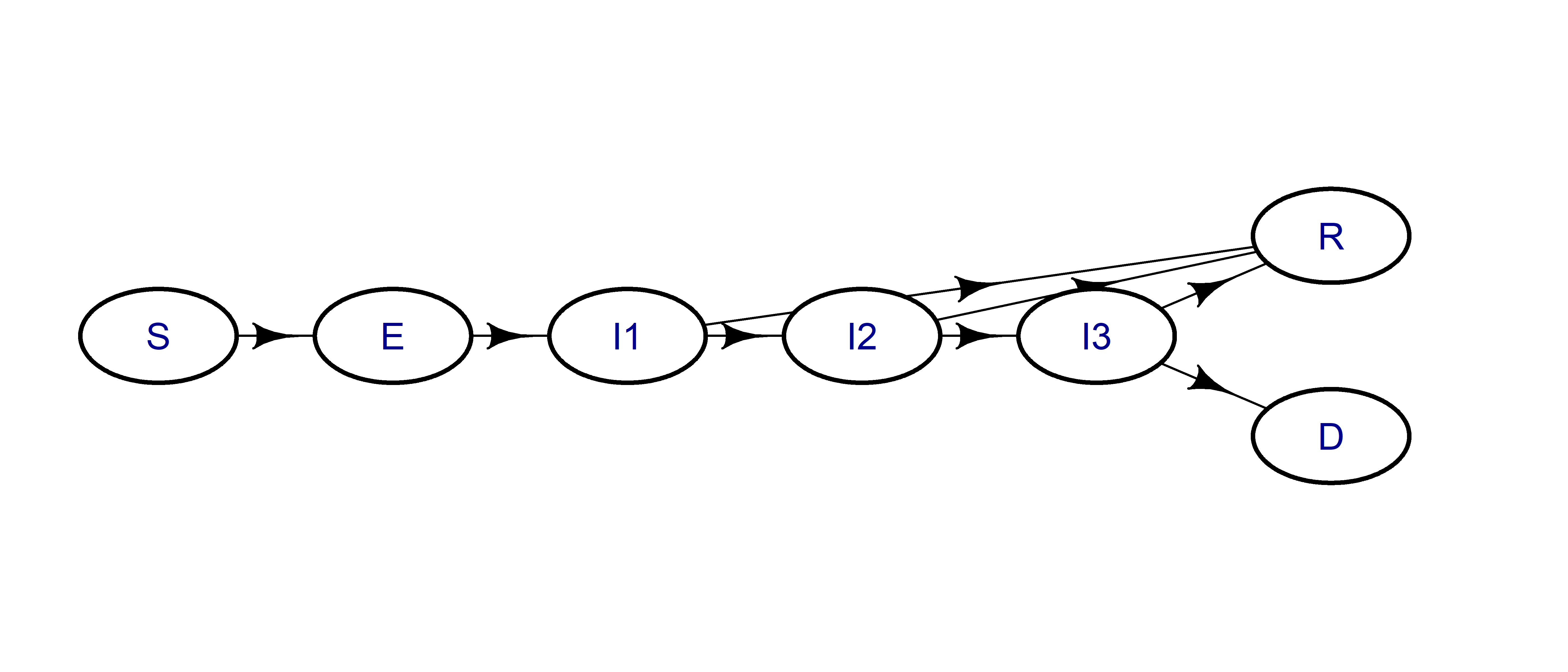
And here are the labels for the seven states:
| Label | State |
|---|---|
| S | Susceptible |
| E | Exposed |
| I1 | Mild infection |
| I2 | Severe infection |
| I3 | Critical infection |
| R | Recovered |
| D | Dead |
Some advantages of microsimulations
I like microsimulations because they create “individuals”, and that makes it easier for me to see what’s going on at any point in time. It also makes it easier for me to change to the model and generate bespoke summary statistics (e.g., the number of infected people going to hospital).
It’s also easy to extend microsimulations to account for individual characteristics. For example, we could increase the risk of infection-related death by age. We can also easily create groups of people, such as families or health-workers, and then modify their risk over time.
Estimates of COVID infections over time
This work builds heavily on Alison Hill’s model, and I recommend looking at that first. The table below shows the key model assumptions:
| Parameter | Value |
|---|---|
| Incubation period, days | 5 |
| Duration of mild infections, days | 6 |
| Fraction of infections that are severe | 0.15 |
| Fraction of infections that are critical | 0.05 |
| Probability of dying given critical infection | 0.4 |
| Time from ICU admission to death, days | 8 |
| Duration of hospitalization (severe infections), days | 6 |
| Transmission rate (mild infections) | 0.33 |
| Transmission rate (severe infections, relative to mild) | 0.1 |
| Transmission rate (critical infections, relative to mild) | 0.1 |
| Population size | 1000 |
Microsimulation numbers over time
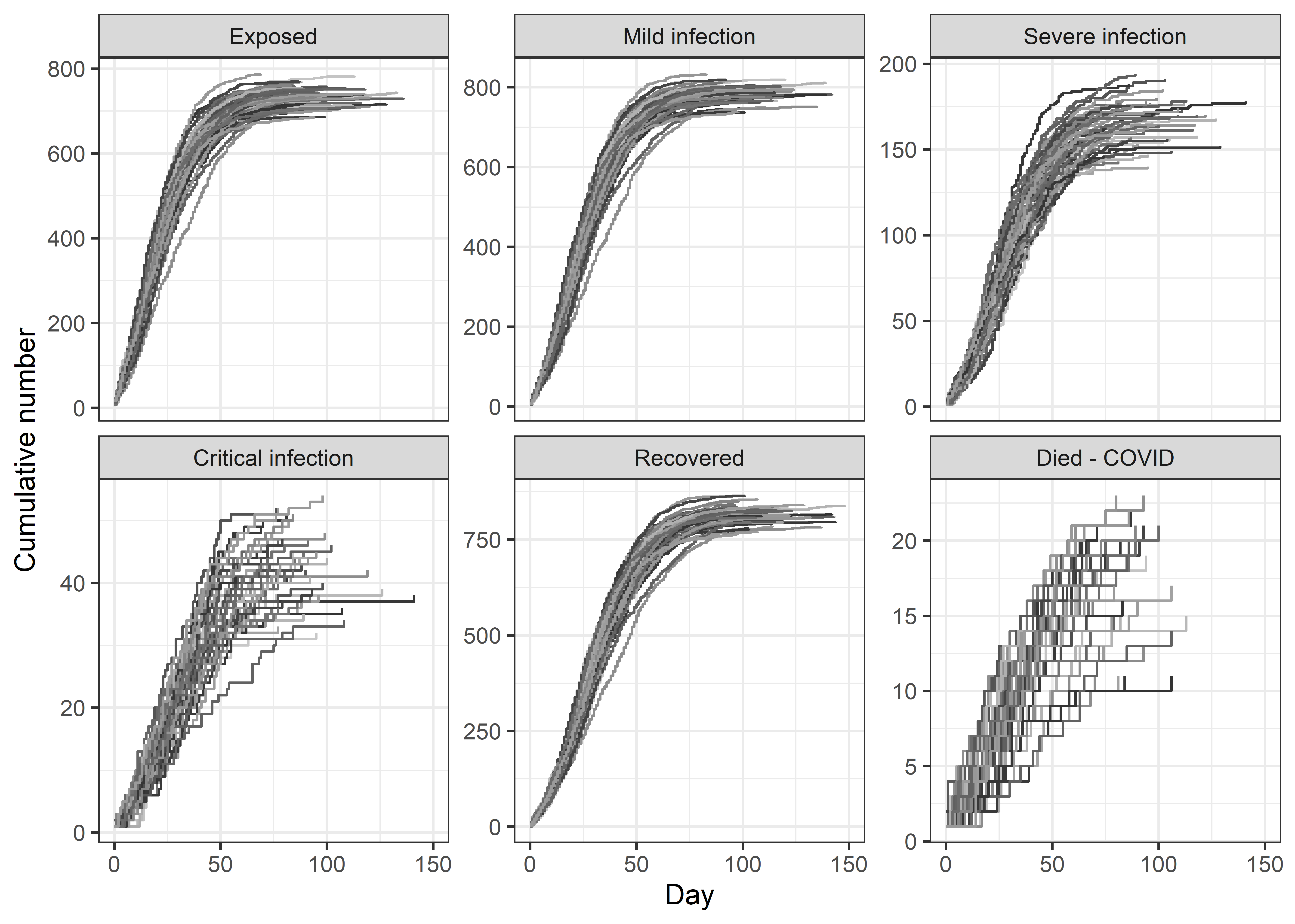
The plots below show 50 versions of the daily cumulative number of infections, recovered and dead. Because microsimulations are stochastic, we get a different answer when we re-run the same simulation. So the plots show the stochastic uncertainty in numbers.
Comparing microsimulations with ordinary differential equations
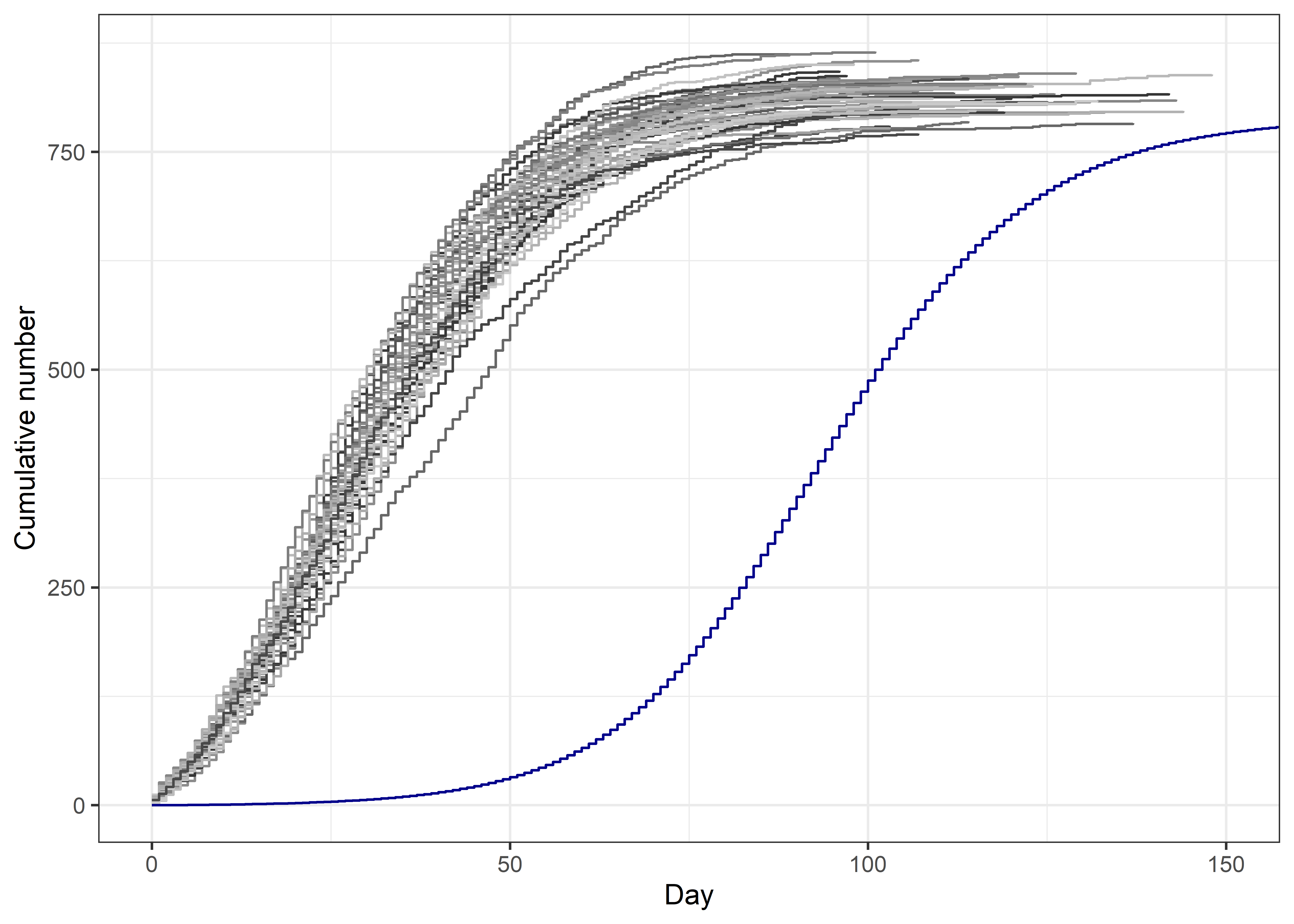
Below I plot the 50 versions of the number recovered from microsimulations (grey lines) with the number using ordinary differential equations (blue line). The ordinary differential equation model takes more time to get going, but then displays the similar S-shaped curve. The microsimulations start earlier because they need a decent number of infections to ‘seed’ the model, otherwise they can fizzle out. I assumed 1% of the population were “exposed” at day 0. The ODE model starts with just 1 “exposed”.
Numbers in each state
The table below summarises the number of events across the 50 simulations using the median count and 90% confidence interval.
Quitting from lines 183-202 [tables] (covid-uncertainty.Rmd)
Error in format.default():
! invalid value 0 for ‘digits’ argument
Backtrace:
- pander::pander(count.summary.final, digits = 0, style = “simple”)
- pander:::pander.data.frame(count.summary.final, digits = 0, style = “simple”)
- pander::pandoc.table(x, caption = caption, …)
- pander::pandoc.table.return(…)
- base::sapply(…)
- base::lapply(X = X, FUN = FUN, …)
- base::format.factor(X[[i]], …)
- base::format.default(…)
The median number of recovered per 1000 people was 818 with a 90% confidence interval of 781 to 854. The number of recovered using ordinary differential equations is 790, this number is within the 90% confidence interval but towards the lower end, this may be because the microsimulation starts with 10 exposed, whereas the ODE has just 1.
Next level uncertainty
As well as stochastic uncertainty, there is uncertainty in the key parameters. For example, we used a death probability of 0.40, but there is likely some uncertainty in this. In health economic models, we often just perturb the best estimate by \(\pm\) 10% using a Uniform distribution. Preferably we try to estimate the uncertainty in the parameter using the published evidence, but for now I will just perturb every parameter in the table by 10% (except the population size) and re-run 50 microsimulations.
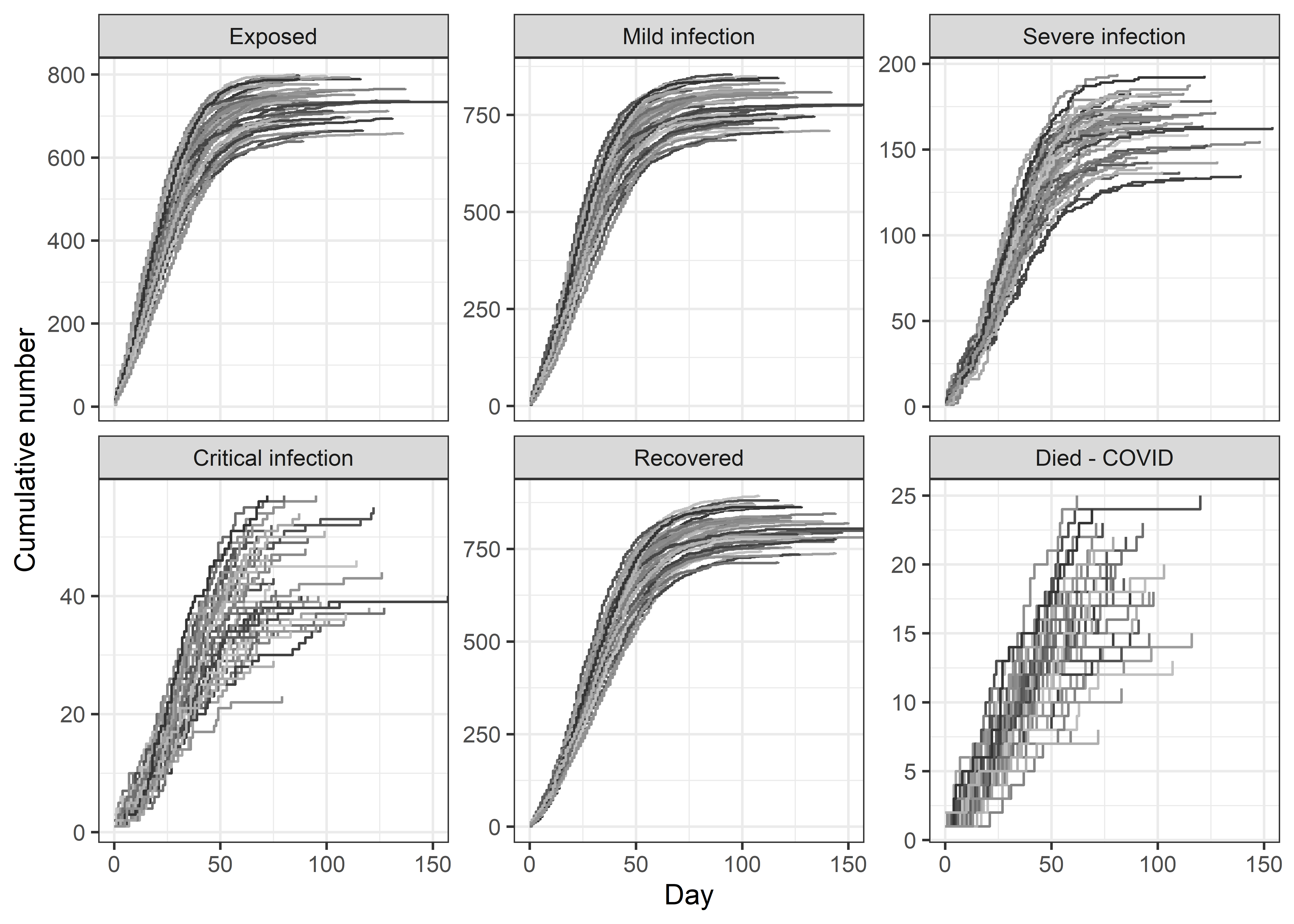
The table below shows the estimated numbers in each state, which now include stochastic and parameter uncertainty. Comparing with the previous table, we can see little difference in the median (as expected), but a relatively wide increase in the confidence interval.
Quitting from lines 246-260 [tables.vary] (covid-uncertainty.Rmd)
Error in format.default():
! invalid value 0 for ‘digits’ argument
Backtrace:
- pander::pander(count.summary.final, digits = 0, style = “simple”)
- pander:::pander.data.frame(count.summary.final, digits = 0, style = “simple”)
- pander::pandoc.table(x, caption = caption, …)
- pander::pandoc.table.return(…)
- base::sapply(…)
- base::lapply(X = X, FUN = FUN, …)
- base::format.factor(X[[i]], …)
- base::format.default(…)
Ideally I would go through the evidence and assign a statistical distribution to the uncertainty for each parameter that reflected the uncertainty in the evidence. However, what I think is useful is to consider the uncertainty in the estimated of deaths and infections, and ideally decision makers are being shown these ranges as well as the mean or median.
Caveat: This work has been done relatively quickly whilst also trying to home-school.
Update (4 April 2020)
I have updated the code to:
- Count the number of people presenting to hospital
- Include a winter peak in transmission
- Add random new exposed cases over time to model imported cases
- Include deaths from other causes using a Gompertz function
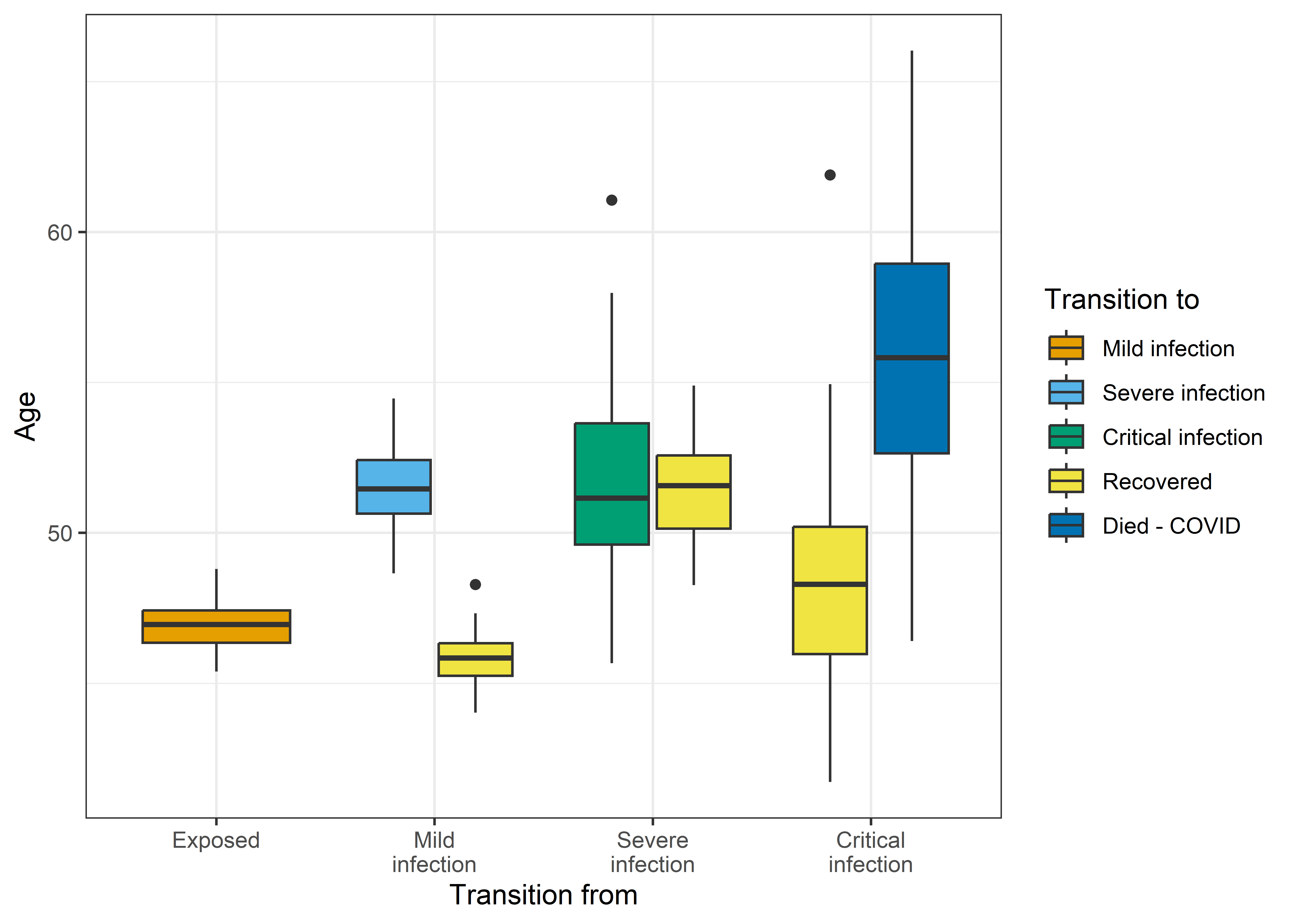
- Increase the rate of recovery for younger people from mild and critical infections
The box-plot below shows average ages for 50 simulations for transitions between the infected states and recovery or death. The model has created clear age gaps, as younger people are more likely to recover from mild infections and less likely to die when critical.
Acknowledgement: Computational resources and services used in this work were provided by the eResearch Office, Queensland University of Technology, Brisbane, Australia.
Reference
Stephen, Dimity Maree, and Adrian Gerard Barnett. 2017. “Using Microsimulation to Estimate the Future Health and Economic Costs of Salmonellosis Under Climate Change in Central Queensland, Australia.” Environmental Health Perspectives 125 (12): 127001. https://doi.org/10.1289/ehp1370.